

You invested good money into a website, yet your inbox stays quiet while competitors stay busy. It is frustrating to watch people visit your pages and leave without getting in touch. Most of the time, the problem is not your service or your pricing, but hidden design roadblocks that make enquiring feel like hard work.
The quick answer
IN SHORT
When a website is slow, confusing on a mobile phone, or vague about what you actually offer, visitors simply close the tab and call someone else. Fixing these five common layout and messaging traps turns passive browsers into paying clients without spending an extra cent on advertising.

Most local buyers check your website on a phone before deciding to call you.
Why this matters
Every person who lands on your website has a problem they want solved quickly. In South Africa, most of those visitors are browsing on their mobile phones between meetings, in traffic, or on the couch after hours. If your site makes them pinch and zoom to read tiny text, wait ten seconds for heavy photos to load, or hunt for a buried contact number, their trust drops immediately.
People judge how organised and reliable your business is by how effortless your website feels. When a site looks dated or breaks on a smaller screen, buyers quietly assume your service might be disorganised too. Instead of complaining, they simply click the back button and hire the next business on Google whose website feels clear, fast, and welcoming.
What to do, and what not to do
DO
✓ State clearly what you do and who you help immediately.
✓ Keep contact forms short with only three or four fields.
✓ Place a clear call-to-action button on every single page.
DON'T
✕ Hide your phone number or email address in the footer.
✕ Make visitors fill out ten boxes just to ask questions.
✕ Use heavy, unoptimised photos that drain your visitor's mobile data.
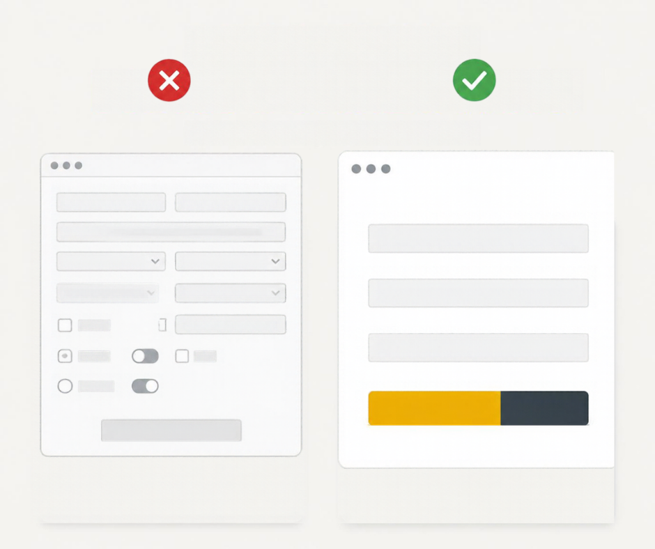
LESS Form. MORE Connection. Clean forms get more replies.
How to do it, step by step
1. Open your website on your smartphone using mobile data.
Look at your home page with fresh eyes and check if a complete stranger can tell what you sell, where you work, and how to reach you within five seconds without scrolling.
2. Test your own enquiry process from start to finish.
Tap every button and send a test message through your contact form to see if it feels effortless, or if broken links, tiny buttons, and confusing menus get in the way.
3. Hand your findings to a professional web design team.
Instead of losing weekends wrestling with templates and technical settings yourself, ask our team through our Services page to rebuild those friction points into a smooth, high-converting layout.
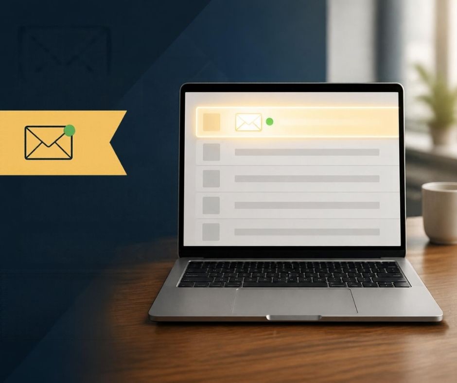
Stop new client enquiries and messages from landing in your spam folder.
The mistake we see most
The biggest trap we see is the silent broken contact form. A business owner assumes nobody is enquiring, only to discover months later that website messages were failing to send or landing in a spam folder. We fix this by building reliable, tested enquiry systems connected directly to your inbox, backed by instant on-screen confirmation so leads never vanish.
KEY TAKEAWAY
Open your website on your phone today and send yourself a test enquiry to see exactly how easy, or frustrating, it is to hire you.